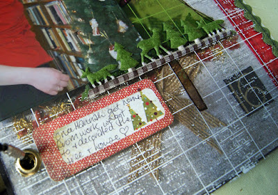
The colour is definitely popping!
This time... some smaller yellow pompom to help :)
Love the colour in this Basic Grey Jovial Lace Doily
I used the other half of it in the very first page of this album (all used up now boohoo)
Stuck down against the black Basic Grey background paper
and the eyelets set in. These eyelets are much larger than the Crop-A-Dile ones
as its needs easier movement with the wooden covers. These were purchased at a
hardware store with a the pincher thingys.. whatever they are called!
It kinda gives another dimension when a photo is pushed behind the edge of fancy paper
with other photos one the top side
---------------------------------------------------------
DAY 11
It's always fun to try capture the antics of pets...
This page will probably bring some giggles to my three girls knowing the
personality of one little rascal!
And how fun that Basic Grey Jovial had a little bird sticker on its Sticker page.
All I had to do was to put a bit of bling string in its mouth to represent Chirp flying off
with Maggie's treat.
And you can find different ways of putting the date on each page too,
it worked well on a 3D present sticker
-----------------------------------------------------------------
DAY 12
Red white and black can be striking colours together so tried to stick mainly to the three.
The little diecut window even got a few smudges of black and red ink because
it was a little 'stark' as it was. It toned it down a bit.
Arent the little cardinals cute and added to all the horizontal lines going on
on the page.
----------------------------------------------------------
DAYS 14 & 15
The reason I've put these two days together is because as a transparency page,
everything need to be measured back and front so it works...
and the reverse side....
The tree is actually cut from a Fancy Pants 12x12 transparency page.
I couldnt see myself using the whole big page, so cutting out the tree works well!
The tree is actually cut from a Fancy Pants 12x12 transparency page.
I couldnt see myself using the whole big page, so cutting out the tree works well!
I've stitched the ricrac on both sides of the transparency for a nicer edging.
Just stuck it down with glue first so it held its place to sew the both sides at the one time.
Just stuck it down with glue first so it held its place to sew the both sides at the one time.
And here's a peep how the transparency page looks now in the album
because while the page looks quite plain sitting out by itself, once it has its place, the page before and the page that comes after increases its interest and busy-ness.. and can change its colour :)
Day 14 actually sits over a grey page, so looks much lighter in colour , and you can see the red fabric strip edging of the next page
Day 15 sits over a black page and looks competely different
------------------------------------------------------------------
DAY 16
It's a pretty straight foward page..
Because Hannah works in a Library, I've still tried to make it relative and festive by
using stars with book print on them
-----------------------------------------------
Click HERE
if you would like to see the first part to my 2016 December Daily
We'd love you to share all your process and December Daily journey with us
below:
We'd love to see them!


Ooooo! I had a chuckle with Maggie and Chirp...too cute. AND your little birdie sticker. Love it! I know I say it ALL the time, but I just love how you do transparencies. Mine never look that good.
ReplyDeleteLove every bit...especially the transparencies. VERY clever! love the birdy page too... those pressies across the page in the middle look great. and ric rac. MUST get mine out as I'm loving how you & Jane are using it!!!
ReplyDeleteWhere to begin! Love the flowery doily, so gorgeous for a wedding themed page. Love the red, white & black! Love the clever clever transparency page! Amazing & totally inspirational!
ReplyDeleteLove the bright colours with the black backgrounds and I love the transparency pages too!! Fabulous work!!
ReplyDelete